Project: Player Shot Data Visualization
- Bryce Haase

- Jan 26, 2021
- 12 min read
This project is a continuation of my last few projects where I looked at different applications of NBA shot data from 2015-2020. While my last few projects looked at the league as a whole, this will look at individual players. The goal was to build three different types of shot charts that could tell the user different things depending on the chart used. Having the data is just half the battle, as visualizing the data in a way different people can understand is what is needed to impact the decision-making process of your overall decision makers.
In this article, I am going to go through the process of how I went through the project, The advantages and disadvantages of each separate chart, and some interesting shot charts from players around the league.
The results from the project look like this:


The code for this project can be found below:
Process
This was a fun project that had a lot of steps involved to make it happen. This section is going to be about how I went about writing the code and implementing what I wanted to do, so if that doesn't sound interesting than move right along to the next section.
First, I already had code from my last few projects that could apply to this one. This was the definition of how to average a variable, how to get shot location data from each distance, how to make a list from different strings in the CSV, and how to make general charts.

The first challenge I had to tackle was creating a list of all the player names in the database (lines 69, 93-94). I also wanted to create a nested list to use for finding the average of how much a shot is worth at each distance in feet (lines 70, 90-91) for finding location eFG% later. I set N to 47 because I didn't want to use shots taken from beyond half court.

Next, I wanted to get the values I would be using to plot all of my data later. To do this, the first step I took was to create a few lists that I could plug data into (rows 112-121). With the lists created, Python would then parse through the CSV and take the data with the row from the player name from the user input (we'll get into that in a second). The data is only used if the shot distance is in the frontcourt (line 134). The data is then put into its respective list, with some data only being inserted for a made field goal (lines 137-142) and some data being inserted for a missed field goal (lines 143-146). Other data would be inserted either way, so they were outside of the if-else statement (lines 148-151). After that, the data for the X and Y locations were corrected so that they could be properly graphed onto a shot chart (lines 154-157), and two new lists were made for all the shots at X and Y locations (lines 158-159).

The next big challenge was having to draw the court so a shot chart could actually be made. This is where the internet came in handy, and I credit this website for showing me how to draw a basketball court in Python. If you want to learn more about how to draw the court, the website explains it better than I could.
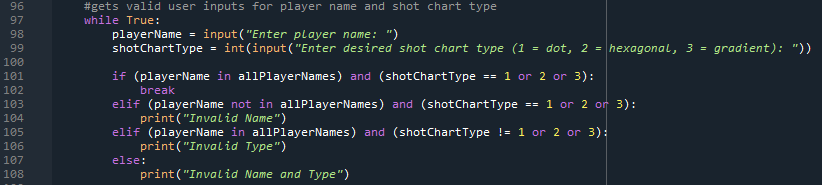
Next, I had to write some code to get a user input on which player and what kind of shot chart they wanted (lines 98-99). It's a pretty simple while loop which will break when the user put's in a valid input. It also stores the user inputs into variables that can be used to get the data (as I showed earlier) and print out the correct shot chart.
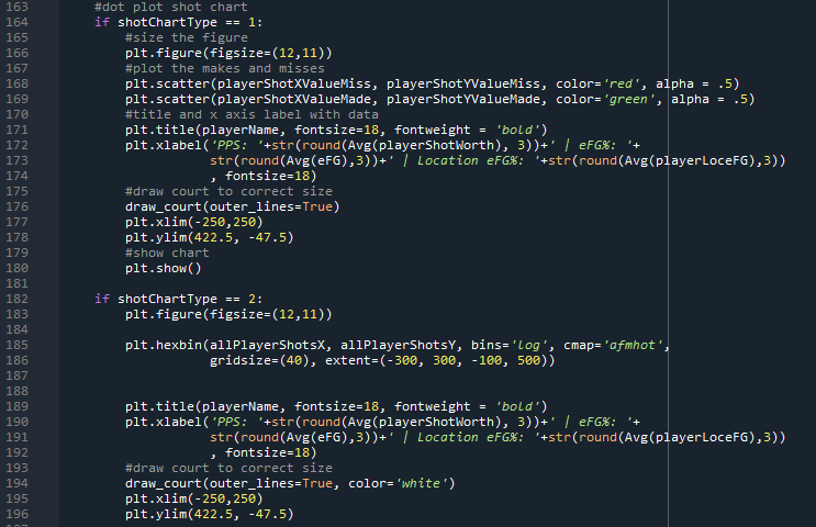
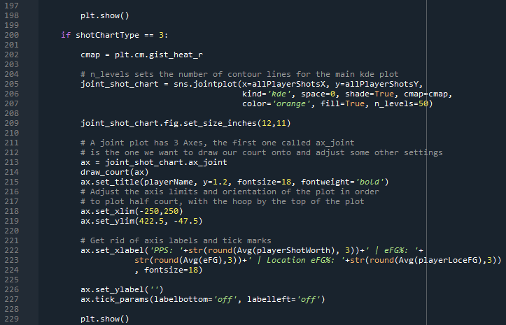
The last step in the process was actually printing the shot charts. The type of chart printed would be dependent on the user input of shot chart type. 1 prints a dot style shot chart, which is just a simple scatter plot. I printed separate variable for the makes and the misses, having the makes be green and the misses be red. The graph is also labeled at the top with the player name and at the bottom with the player's point per shot, effective field goal percentage, and location effective field goal percentage (applicable to all graphs). 2 prints a hexbin graph, which essentially separates every area in the chart into small hexagons which will turn different colors for where a player is shooting. Lastly, 3 prints a joint plot of style kde, found in seaborn. This prints a heat map (I called it gradient style) which turns colors where a player shot more often. It also gives a line graph on the top and right side of the chart, again visualizing player shot locations.
It is easy to sit back now and explain the process, but the process was definitely not easy. It took a lot of patience, problem solving, and trial and error, but I am happy with the overall result and I hope going through the process can help you do this project on your own or is just interesting to see.
Advantages/Disadvantages/Implications of each chart
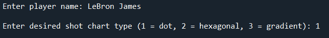
When the code is run, a message like this will pop up, asking for the user input for player name and shot chart type:
This section, I will go through each shot chart type and talk about what is good, what is bad, and how to apply the charts to real world thinking.
Something that will be on all the charts at the bottom is PPS, eFG%, and location eFG%. PPS is short for Points Per Shot, which tells us how much an average shot is worth in terms of points from the given player. eFG% is field goal percentage weighted for if the shot was a 2 or a 3, meaning that any shot taken from 3-point land is give a 1.5x boost. Location eFG% tells what the eFG% of a player would be if he shot league average on every shot from every distance. This can give us a decent indication of shot selection based on location, as well as if the player can make his shots at a higher clip than league average or not.
1. Dot Style Shot Chart
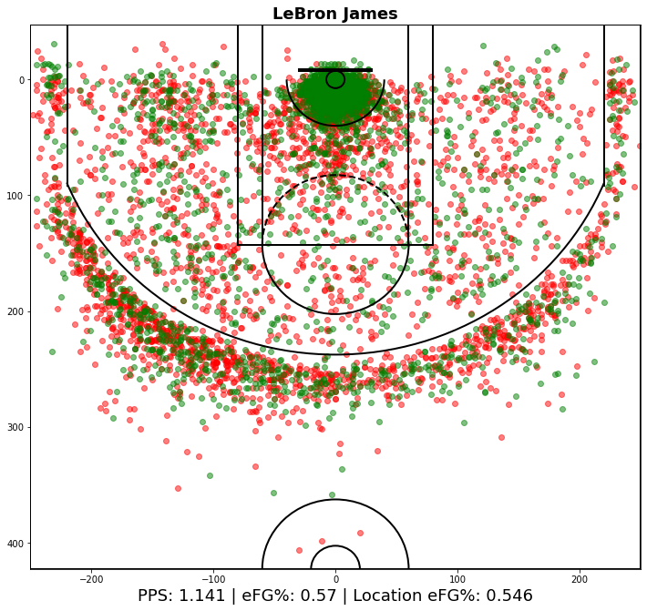
The dot style chart is the most traditional and simplest to understand. The green dots are made shots, and the red dots are missed shots. You can tell where the player likes to take his shots from where the dots are located, and you can tell how good he is from each location based on green vs. red dots. In the example above, we can tell LeBron James is really good around the rim, likes the three from the left wing, and works a lot in the mid post area about 3-4 feet away from the left block.
An advantage of this style of chart is that we can see makes and misses. Another advantage is that we can actually see every shot, and not just the top x number of locations. This chart is limited in the fact that the green dots are placed down after the red dots, meaning that if a player makes a lot of shots in an area (generally around the rim), then you won't be able to see the misses. This style of chart is good for getting a general feel of where a player likes to get his shots from, and how successful he may be from certain areas/distances.
2. Hexagonal Style Shot Chart

The hexagonal style chart is the one that is most eye-catching. It is also relatively easy to understand. In the chart above, we can see the shot distribution for Stephen Curry. Curry shoots a lot of threes and a ton of layups. You can tell this from the areas with are the lightest. You can also tell some other interesting quirks about Curry's shot locations from this graph. These include the fact he shoots more from the left corner than the right corner, his most common mid-range location is from the right elbow, and he takes some floaters down the middle of the lane. This chart also shows Curry's incredible range.
The first advantage of this chart is that it is cool. That may not seem like a huge advantage but making charts that people will want to look at is part of how to get your data across to others. It is vitally important to any data visualization that it does have some "cool factor." This is limited because it doesn't show makes and misses, only shot locations. Shot locations are important to know where to stop your opponent, but you do not necessarily want to stop your opponent from a shot he isn't good at.
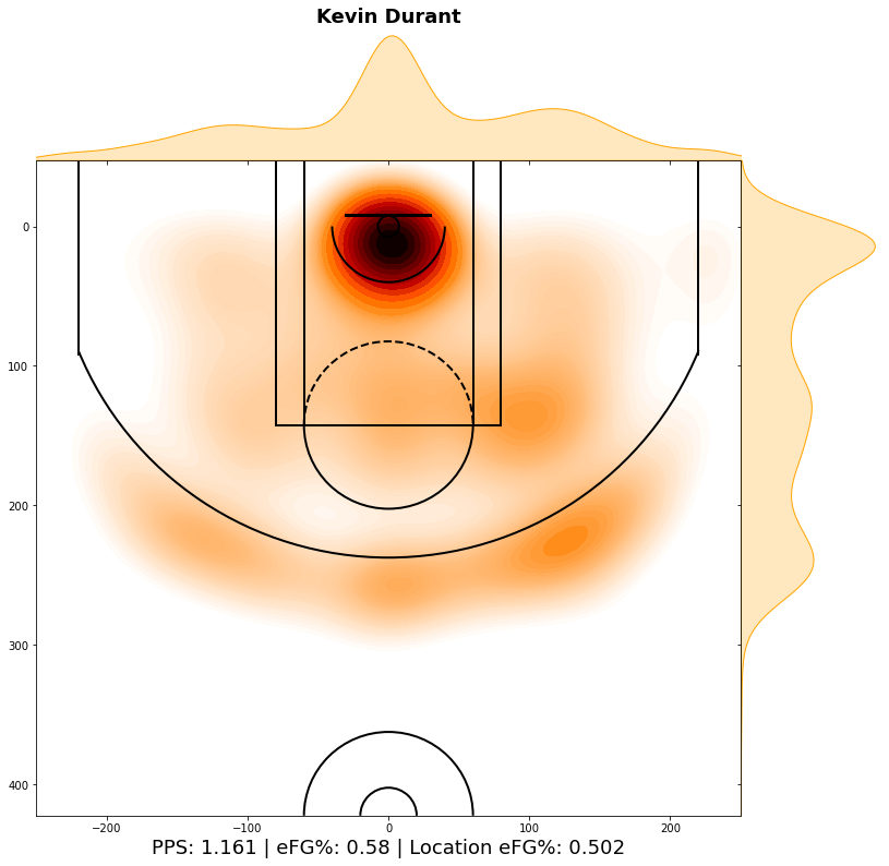
3. Gradient Style Shot Chart
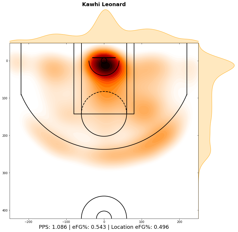
The gradient style chart is the most effective in terms of how much data it presents and how easy it is to comprehend. The chart above has the shot distribution for Kawhi Leonard. The darker the spots are, the more a player shoots from there. Also, the top and right side have line graphs that show how much a player shoots from either the left or right or near the rim or far from the rim. In the example of Kawhi, we can clearly see he likes to operate on the right side of the floor. He also likes to work in the midrange a lot, as players usually have a much larger dip from around the rim to the mid-range. Looking at a chart like this can tell a team the skew their defensive scheme to prevent Kawhi from catching the ball on the right side of the floor.
The biggest advantage of this chart is the line graphs on the sides. This makes it the easiest to visualize where a player likes to shoot the ball from. This graph also shows exactly where players like to shoot from, as shown by the coloring of the graph. The limitation of this graph is that you cannot see makes and misses. Despite this, I still think this is the most effective graph for the visualization of shot data, and it is what I will mostly be using in my next section.
Interesting Charts from Around the NBA
There's no point in writing code that can create shot charts if you aren't going to look at a bunch of them. In this section, I am going to show a bunch of the most interesting shot charts from around the league.
Star Guards:
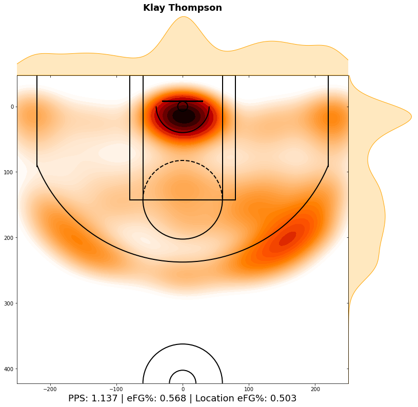
It's unfortunate that we aren't going to get to see Klay Thompson play basketball this season. He is an awesome ceiling raiser, and he would've made that Warriors team a legit conference finals contender. Looking at his shot chart, you can tell he likes to shoot from the right side of the floor. I think this is interesting, as usually a right-handed player coming off a pin down would rather be on the left side of the floor to make to footwork easier going into the shot. I know he likes that wing in transition, however, and that's where most of his threes come from. He has a little more variance to where he shoots from than I would have thought. The efficiency numbers on him are also awesome.
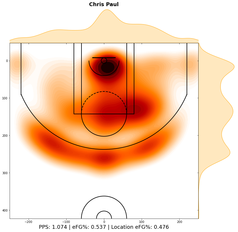
Chris Paul is fun to look at because of how many mid-range jumpers he still takes. Everyone in the league knows once he gets the ball in his right hand on that right elbow it's over for the defense. Paul loves working on that right side of the floor, which is interesting because usually right-handed players shoot better off the dribble after a left-handed dribble. Paul also rarely shoots corner threes because he is ball dominant, and he is a true three level scorer. Also, look at the crazy efficiency of Paul vs. league average.
Star Wings
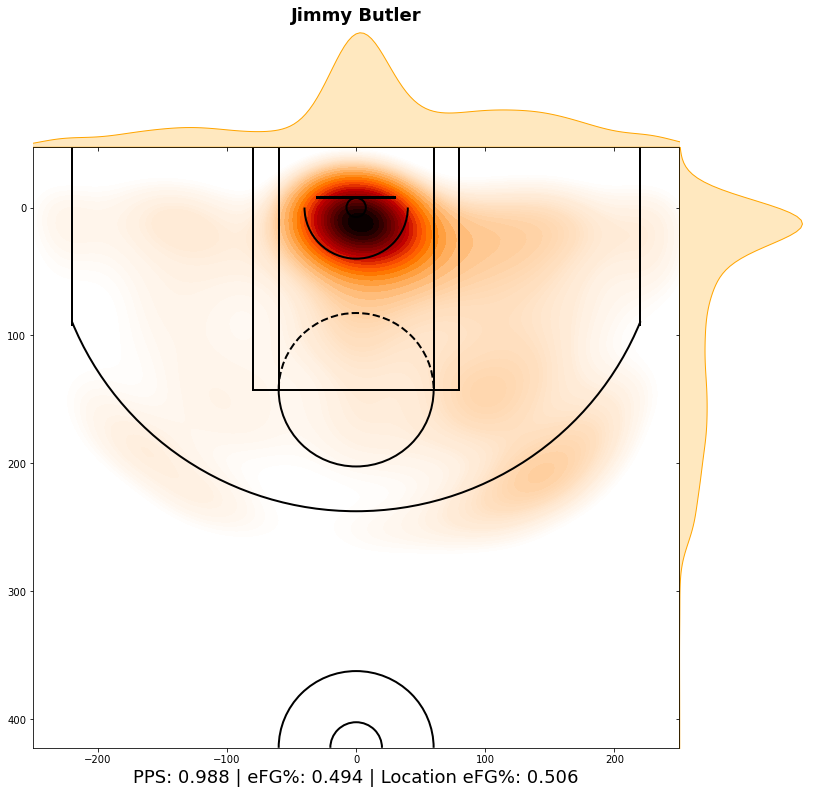
Butler is an interesting one because he doesn't shoot threes very often. In today's NBA, shooting is very highly valued, and it is interesting that Butler has been able to be so successful without that element of his game. Part of the reason he is so successful is because he really knows how to get to the rim. I don't know exactly how he does it so consistently when teams aren't afraid of the jumper, but his ability to get to the rim and the line make him a good offensive player. He also is another guy who likes the right side of the floor better than the left.
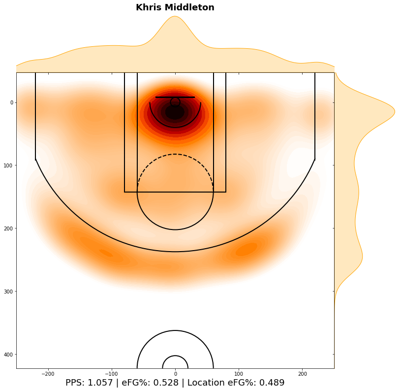
I love Middleton's game, and he is another guy who is a true three level scorer. He operates more on the left side of the floor, which makes sense because he likes to shoot a lot of pull up midrange jump shots. While he favors the right side of the floor, Middleton's shot chart is one of the more diversified charts I have seen. He can score from anywhere on the floor, which is why he is such a good offensive player. He also does it on plus efficiency.
Star Bigs
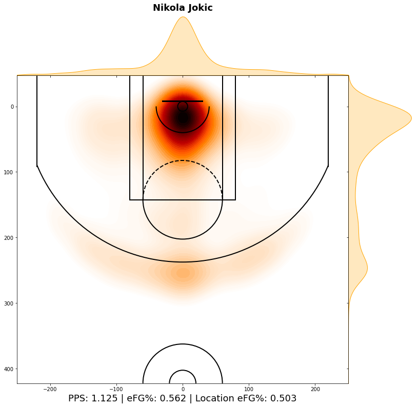
If you were expecting more diversity in the Joker's shot chart, you wouldn't be alone. Jokic takes most of his shots from around the rim in the center of the court, which I was surprised to see considering how often he operates on the perimeter. He favors the left block more than the right block, which makes sense because it is easier the whip right-handed passes to open players from the left block. For the most part, he operates in the middle of the floor and shoots threes from the top of the key, which is a result of the Nuggets 5-out and delay sets they run so often.
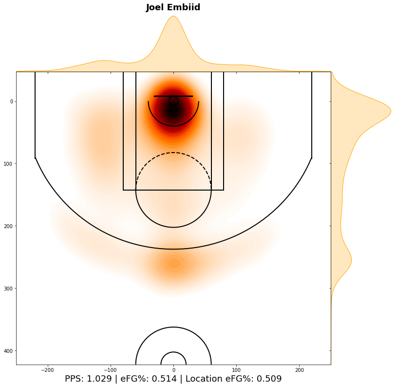
Embiid's shot chart looks more like what I thought Jokic's would look like. He has a relatively diverse chart for a big man. He likes to operate on the left block, just like most bigs, as the ball will be in their right hand as they dribble towards the middle of the lane from there. He also likes to favor his face up game from the right side more often, again because it is easier to drive right from the left side of the floor. Obviously, most of Embiid's looks come from right at the rim. Most of his threes are from the top of the key, and the reason for that is when he catches the ball on the perimeter it is usually after a pick and pop, and that's where he pops out to.
Shooters
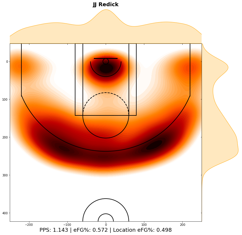
Shooters are fun to look at. JJ Redick has been a pure shooter in this league forever, but that doesn't mean he doesn't get a lot of shots at the rim. Redick has learned how to back cut a defender who is top locking him during his long career, which is why he does get a lot of looks at the rim. Redick is known for always coming off screens to his left, so I am fairly surprised that he shoots a little more from the right side of the floor. Maybe that is from teams taking away the other side of the floor more, forcing him into a shot he likes less.

Korver is another fun shooter who has been doing it forever. He surprisingly gets less shots at the rim than Redick, despite being three inches taller. I think Redick is just a better off ball mover than he is, which is why that may be. He shoots more threes from the left side of the floor than the right, which makes sense because he is another guy who likes to be coming off of screens set of his left side. Korver is here because of the staggering difference in his shot profile from around the rim to three-point range, but he has been incredibly effective in the shots he has taken.
Post Players

Valanciunas is part of a dying breed of players who operate mainly out of the post. Again, he prefers the left block over the right block. Most of his shots come right at the rim, which is why his individual numbers are good, but having someone in the post just hurts any teams general spacing. He has started to try and shoot more three's, but he hasn't shot that many, as you can see.
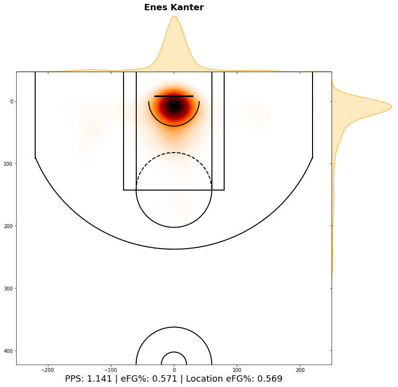
Not much analysis needed here, as Kanter literally only shoots from less than three feet from the rim.
Random Others
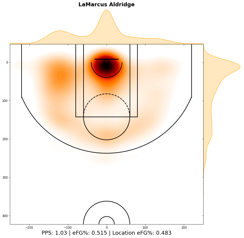
LaMarcus Aldridge is a popular example of how a shot chart can tell you a lot about a player's tendencies. LaMarcus loves to operate on that left side, and he is pretty effective there. Where he is not a comfortable is on the right side of the floor. More and more, teams have been noticing this with data visualizations such as the one above and have been defending him in a way where they try to prevent the catch on the left side. Shot charts can really help when game planning for someone like Aldridge.
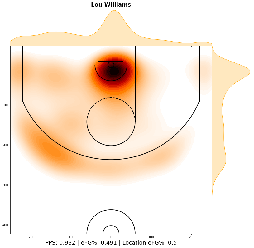
Lou Williams is famous for going to his left every time he has the ball, and I was just curious to see that on paper. The results did not disappoint, as you can tell Lou clearly favors his left, and likes to operate on the left side of the floor. This would be because he runs a lot of ball screen action from the top of the key that allows him to attack left and look for a pass to the big or a pull up. Interestingly enough, his finishing around the rim is more skewed to the right-hand side of the rim, telling me Lou favors reverse layups or step throughs to the other side of the rim when finishing.
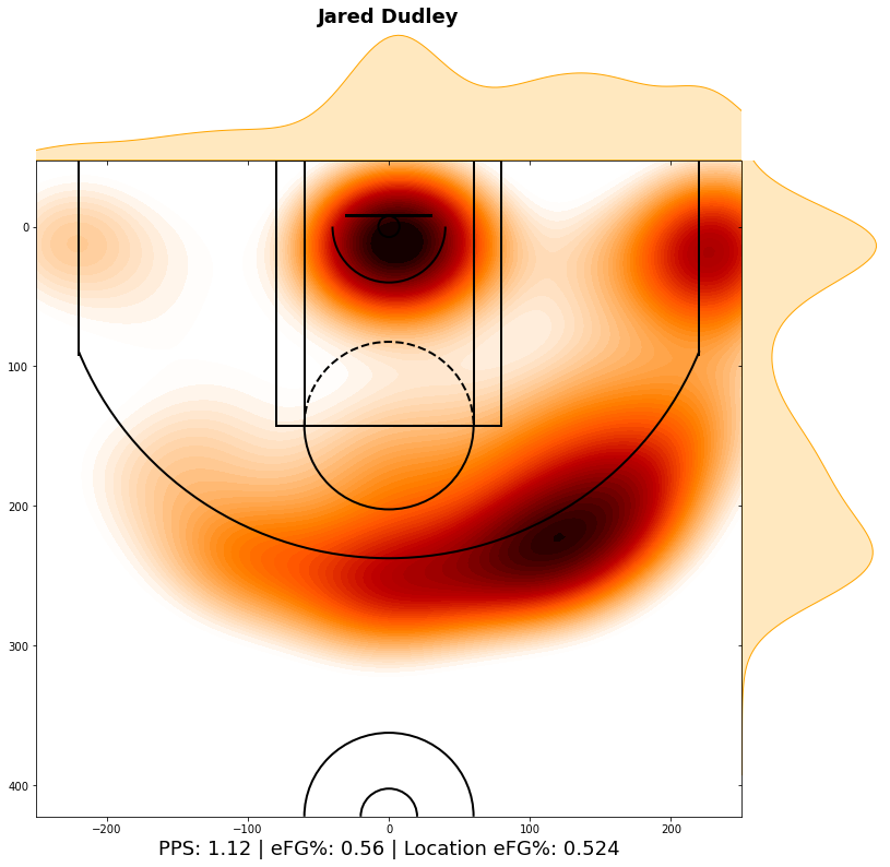
I have no idea why I thought of looking at Jared Dudley's shot chart, but I'm glad I did. I don't have the slightest clue as to why Jared Dudley only shoots from the right-hand side of the floor. Dudley is generally spotting up, so I guess he spots up from the right side while ball screen action is happening on the left, as that's where righties would prefer to operate. That would be my only guess, but this is definitely a weird one.
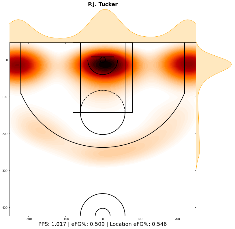
Everyone knows about P.J. Tucker, but did you know it was this extreme? I was expecting something not as crazy as this, but I guess Tucker has really honed into his role. He pretty much shoots exclusively from the corners and around the rim. I mean, you can't really blame him for finding a niche and bringing positive value to his team that way.
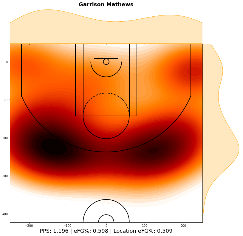
Last but not least, feast your eyes on the incredible shot chart of one of my favorite players in the league:
I hope you enjoyed going through this project. If you want to run the code yourself, you can click on the link with my code and copy and paste it into the Python IDE of your choice.


Comments